How to Analyse Infographics for IB English Paper 1 | 3 Key Techniques
A top-performing guide to analysing infographics for IB English Language and Literature Paper 1. Learn 3 essential techniques with examples and commentary tips to boost your analysis skills.

Infographics are not the most emotional or story-driven texts, but they sure do convey information in a condensed and purposeful way. They’re also a student favorite when they appear in the Paper 1 exam.
Alongside infographics, other visual texts you might face include advertisements, magazine covers, and charity appeals. For a full breakdown of how to approach any visual text, head to the main visual text guide for IB English Paper 1.
Let’s dive into the conventions and techniques that make infographics unique and what to look out for – so you can craft a well-rounded analysis for an infographic.
Conventions of Infographics
1. Visual Hierarchy & Layout
In infographics, a good layout is key to guiding readers through information logically. Visual hierarchy helps viewers focus on what's most important first. Designers use size, color, and positioning to create this flow, making information easy to absorb.
Take this habitat change infographic by WWF for example. It follows a clear, three-column structure: the first one speaks about habitat loss, the second one is on species extinction, and the third half is for food waste.
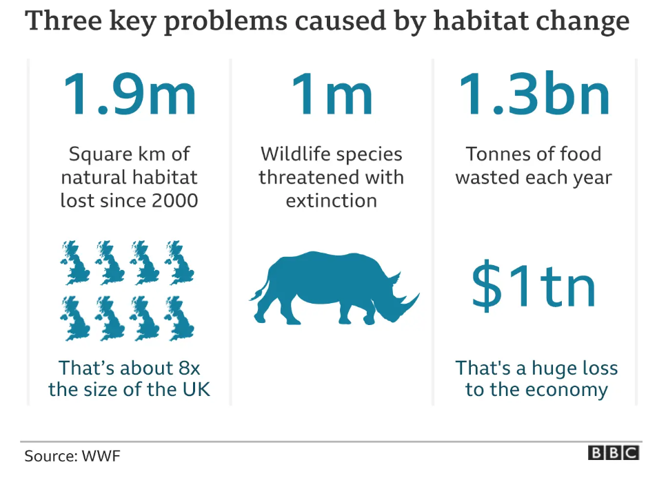
Smaller text underneath explains these figures, making them more understandable. For instance, "1.9m" is highlighted in large font to catch our attention, and it’s then continued with "Square km of natural habitat lost since 2000," and the icons help explain how the lost habitat is about "8x the size of the UK." This left-to-right layout mirrors natural reading patterns, and the color contrast helps keep the design clean and easy to follow. Each section stands alone yet connects well with the others, creating a unified message about habitat change.
When analyzing visual hierarchy, ask yourself: What are the main sections, and how are they different visually? How does the layout guide your understanding? Are certain elements emphasized to highlight the main message? These design choices help creators guide you through the content, making it more impactful and easier to grasp.
2. Purpose and Audience
Infographics are designed with a clear purpose and target audience, which is reflected in their design choices. Let's look at the UN infographic on the "Plan to Restore Biodiversity". Its goal is to inform and raise awareness about conservation strategies, making it suitable for a general audience interested in the environment but not necessarily experts.
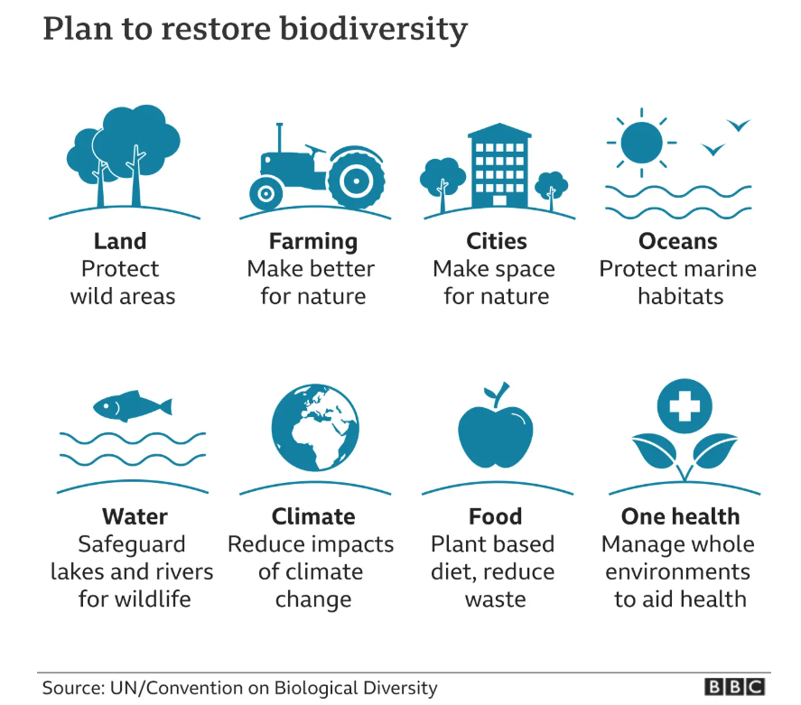
Also, the infographic uses simple icons in soft blue colors, creating a calm, optimistic tone. Each strategy—like protecting wild areas or reducing climate impact—is easy to understand and visually appealing, with icons like trees and fish. This approach makes the information approachable and less intimidating.
And the use of concise, friendly phrases such as farming’s "Make better for nature" and oceans’ “Protect marine habitats'“ reinforce the positive message and encourage action without overwhelming the viewer. So we can say this specific layout and color scheme in the UN infographic does have a sense of harmony and interconnectedness, and does keep the audience in mind.
When analyzing an infographic, consider these questions: Who is it for? What message does it convey? How do design choices appeal to the audience? This helps you see how the infographic communicates its message and inspires action.
3. Color and Typography Choices
Color and typography play a vital role in making infographics both readable and impactful. In this Extinction Crisis infographic from BBC’s website, the use of the colour red in each circular icon immediately catches the viewer’s eye and conveys a sense of danger and urgency. Red, a color commonly associated with warnings, highlights the percentage of species at risk, making the message impactful. The repeated use of red for each icon reinforces the severity of the crisis across multiple species categories, from amphibians to birds.
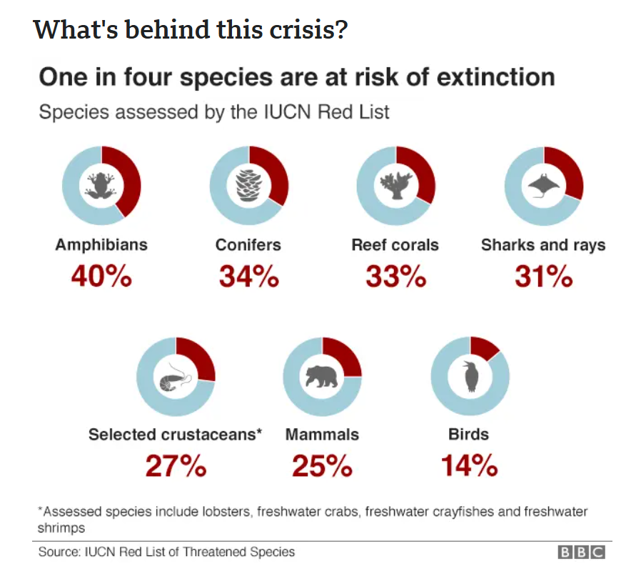
In contrast, the light blue background of the circular icons provides a visual balance, ensuring that the red elements stand out without overwhelming the reader. This blue tone, which is calm and neutral, serves as a subtle backdrop that doesn’t detract from the infographic’s urgent message.
Typography choices also contribute to the infographic’s tone and readability. The headline, "One in four species are at risk of extinction," is presented in bold black font, giving it prominence and establishing the infographic’s theme. Additionally, the species categories (e.g., Amphibians, Conifers, Reef corals) are labeled in bold, helping readers easily identify each group. The percentages are presented in a larger, red font that matches the color scheme of the icons, emphasizing the alarming statistics and making them easy to locate at a glance.
When analyzing an infographic, consider how color choices set the mood or theme, which elements the colors or fonts draw attention to, and what message these design choices convey. This approach helps you understand how visual elements work together to communicate the critical state of biodiversity loss with urgency and clarity.